Whether you are a band, musician, or producer, one of the first steps you probably took was to create a social media presence for yourself. But have you created a website, yet?
Many music artists put creating a website on the back burner when in actuality it should be one of the most important foundations of your music career.
Building a website as a musician, band, or producer, can be exponentially more valuable than having those social media followers in the long run.
This guide will show you how to build an effective musician website to help you grow your fanbase and sell your music and merch.
- Why should a producer or musician have a website?
- How To Build a Website for Musician, Producer, or Band
- FAQ
- Final Thoughts
Why should a producer or musician have a website?
You hear musicians killing it on Instagram and Tiktok and gaining thousands of followers and views on those social media platforms.
You may even be thinking to yourself why you even need to go through the hassle and learning curve of building your own website. Having your own website, your own space, to create the experience that you want to have when they interact with you, your content, and music is invaluable. It’s one of the first steps to creating a fan.
A website allows you to give them the ability to discover who you are as an artist on your terms, which is not the case on social media platforms such as Facebook, Instagram, and Tiktok.
Let’s go into more detail on why you should have a musician website in spite of the rise of social media dominance:
A Website is Yours
Is that Instagram, Tiktok, or Youtube account really yours? Or do the tech companies own it and only allow you to use their service. Any of these services could go the way of Myspace and disappear along with your followers and the content you created on the service.
A website is a piece of land you are buying. Social Media accounts are on rented land. Which one would be more valuable in the long run?
Especially with all the data you control with having your own website… we’ll talk about that one in a bit.
Your Business Hub
Your website shouldn’t be a simple digital business card. You will probably see advice on other articles that your website is your digital business card, and you should link out to other social media and places to stream/download your music.
If that is the case and its only purpose, then people are doing to do what they usually do with business cards — throw them away — and in the case of a website, never visit again.
As an independent musician, getting people to actually visit your website is one of the most valuable ways to get them started on the journey to being your fan and even customer. Your website should be where the wheels of your music business and career operate. You do this by having an effective website with clear goals
Your Story Perfectly Curated
You control how you want to want to tell your story through your design, content, and branding on your website. Plus, people will not be distracted by Ads or other people’s content. You have control what they see on your website, and you can guide them to want you want them to see or do on your website.
TIP: To have an effective website, you will want to have some kind of goal that you want visitors to do. This could be to pre-save for the next single, buy merch, or subscribe to your email list. You should have a CTA (Call to Action) to prompt them to perform that action. (Think people on Youtube asking you to subscribe)
Learn More About Your Audience
You can get valuable data on the kind of people visiting your website and where they are located, and with the potential to build an email list. You can use this data to plan tours or get insights into your promotional efforts.
But remember…the most important piece of data you should try to get is an email address….you’ll thank me later.
Your Own Store
You probably are only able to sell merch when you are at a gig, which is such a short window of time.
Having a website allows you to have an online shop where people can buy your music or merch 24/7. Maybe you’ll finally get someone to buy those branded mugs your drummer thought was a great idea.
How To Build a Website for Musician, Producer, or Band

Don’t let the image above scare you. This is not what making a website looks like these days. You probably won’t even have to write a single line of code…well, maybe copy and paste only.
This isn’t going to be a step-by-step tutorial on the technical aspects of building a website. I plan on doing that in future articles detailing how to build on each website building platform.
You will learn the broad strokes of how to get started with building a website and the important things you need to consider as you go through each of these steps.
As you go through each of these steps, if you run into any technical problems you can probably google those or leave a comment below and I’ll try to help!
Step 1: Decide On a Domain Name and Purchase
You will need to purchase a domain name. This should be something as close to your artist name as possible and easy to remember.
Now, many of the website builders offer a free domain name with their premium plans such as Bandzoogle or Squarespace so if you already know you are going to go with one of those platforms, you can skip this step.
Having your domain name bundled with a subscription-based website building platform isn’t a good idea.
Plus, it makes it more difficult to get an email with @yourdomain.com, which makes you look even more professional. I know with Squarespace you don’t get an email address unless you go for the business plan.
I would go with a dedicated domain registrar that allows you to get multi-year renewal options.
I have used Namecheap.com in the past, and I’ll outline the process using their service. Most other popular domain registrars will have a similar process.
Other Recommended Domain Registrars:
- Name.com
- Godaddy.com
- Search for your domain of choice.
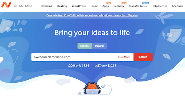
You should get that name or a list of alternative choices.
- Add the domain to your
These days, a lot of different domain extensions these days (.com, .net, .music, .me, .shop…etc), but I would try to stick to .com because people still subconsciously trust that more than other domains.
- Select the Renewal period and privacy protection
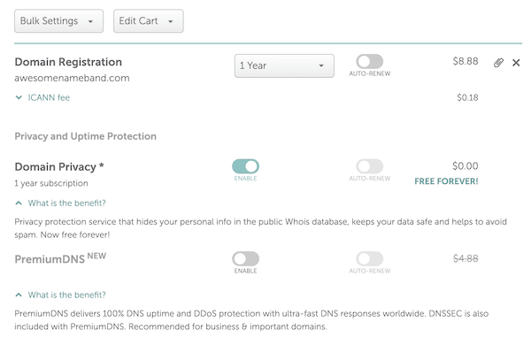
You will want to get as long of a renewal that you feel comfortable with and with some domain registrars you can get free domain privacy, which protects and hides the address you use to register from the public. Some Namecheap offers this for free, but you have to pay for it with GoDaddy.
- Purchase and you are finished!
- Connect to your hosting
Now you have your domain, but you can’t really do anything with it until you have hosting. You will need to decide on what platform you want to use to build and host your website.
Most site builders such a Bandzoogle and Squarespace provide a guide on how to connect an external domain.
We are getting a little ahead of ourselves since we haven’t researched what platform we want to host our website on. Luckily, that is the next step.
Step 2: Select a Platform To Build your Website On
The great thing about building a website these days is that you don’t have to have any coding, HTML, or CSS knowledge to actually design a great looking website. There are plenty of page builders that come with great templates that you can customize.
Each of these platforms comes with their own levels of customizability and unique features. You will have to do a little research to figure what is best for you.
Here are some of the most common choices for musicians building a website:
- WordPress
- Bandzoogle
- Squarespace
- Wix (Don’t recommend)
WordPress
Building a website on WordPress is my first recommendation for most people, but it does create a lot of challenges that you will have to figure out and that will either cost you time or money. But in the long run, the flexibility and customizability are well worth the effort.
So if you want to want to:
- collect email subscribers,
- sell music and merchandise,
- house content
- Host a membership program
- have almost unlimited integrations with other services (Dropbox, Bandsintown, e-mail marketing tools, etc..)
- have total control and flexibility
- have more functionality through thousands of plugins
Then WordPress would be the way to go for you.
Let me give you a short personal example of the flexibility of WordPress.
On my mixing studio’s website, I wanted to have a way for visitors to listen to a before and after version of my mixing work seamlessly. I was able to install a plugin that does exactly this letting people toggle between the version seamlessly.

Would I have been able to have this on Squarespace or Bandzoogle if I needed something similar? No, probably not without having to hire something, and I you don’t have access to coding features until you are on a higher pricing tier.
The team at Indepreneur provides a great overview of the pros and cons and guidance on how to start building your website in WordPress. They are a team of musicians turned digital marketers that help independent musicians, like yourself, build a fanbase by teaching and training you to use proven digital marketing strategies in your own music promotion.
These guys know how to build an effective website for musicians — take a listen to have they have to say.
If you are busy now, here is a link to the podcast.
As a side note, if you are interested in learning more about how to promote your music and build a fanbase, and not relying on sketchy music promoters, check out the review I wrote about Indepreneur and the training they provide.
Hosting
With a WordPress site, you will have to get your own dedicated hosting and learn to manage that. The hosting server is where the actual files for your website will be stored and this will be linked to the domain that you purchased.
Theme & Page Builder
By default WordPress, isn’t a drag-and-drop builder like Squarespace or Bandzoogle. This can make it very difficult to someone inexperienced to build a website using wordpress.
However there are many themes and plugins that allow you to add this functionality to your website.
I use Divi Theme and builder for all of my website currently. This is a premium theme so it is a little pricy but there are a few other options that are free that can give you very customizable drag-and-drop features.
There are also many themes dedicated for musicians that allow for visual page building.
However, if you took a watched the video above from the guys at Indepreneur, they really recommend going with Thrive Architect for your WordPress Site.
If I was starting again, I would probably make the switch to Thrive as well.
What you need to do: If you are deciding to go with wordpress and you got your domain and hosting connected. I would start to research some good themes that allow the level of customizability that you would like or fits with your aesthetic.
These are the two I am most familiar with
- Divi: This gives you total control of your website in terms of design. It is very easy to make nice looking pages. There is a bit of a learning curve to make sure of all its features. I designed this page using Divi Builder. Check it out if you want see some of the possibilities — I am quite proud of that page, if I am being honest.
- Thrive
Bandzoogle
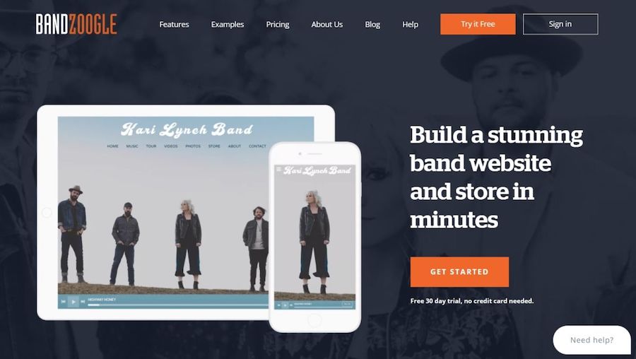
Bandzoogle is a website building platform designed to the needs of musicians. It is pretty popular and is often recommend by the people on the DIYMusician podcast CDbaby.
It is many of the features that you would need to create a simple and effective website. If you don’t have the time to get too keep into the woods of building a website, Bandzoogle can give you the simplicity and in-platform marketing features that will cater to the needs of most musicians.
With Bandzoogle you get:
- A built-in email marketing tools
- E-commerce Ready: Sell merch, downloads, subscriptions, and tickets
- Drag-and-drop Website building
- Fan Analytics
- Intergrations
Some of the lower tiers are limited in the features and you would have to use the Pro Plan to make full use of the all the selling tools.
One of their great points is that they don’t take any commission from your sells. Squarespace for example, takes a 3% fee on all sales through your website (unless you are on a high-tier plan).
As a indie musician or producer, you are probably juggling a dozen different roles as you continue to grow your music career.
Building a website is an important part of this, and Bandzoogle can really help save you time and help ease the learning curve of building a website.
Squarespace
Squarespace is most well known for its gorgeous and dope website aesthetics. That topped with its ease of use and great level of customization and integrations, many musicians have decided to use Squarespace as their website platform.
I’ll be honest, I think Squarespace is probably the way to go if good aethetics are very important to you. With their massive library of templates, you can find a good starting point for you website and customize from there to make it your own.
They have a great set of tools and integrations that allow you to build a powerful website fairly easily. You just have to consider as you grow you might have to upgrade your plan to get access to the features and tools that you need grow your website.
Of all the options, building your website on Squarespace is probably the most expensive in upfront costs, because you will have to at least go with the business tier to get access to e-commerce tools. They also take a 3% fee from all transactions on this tier.
Others Website Platforms
There are a few other website platforms for building website with a lot of promise and would recommend at least checking out. I haven’t done enough research to recommend them yet.
Webflow – This web builder looks amazing! I feel like I would really be able to create a really immersive environment for visitors. It would lead to people staying longer and learning more about you! It’s free to build and try out your design ideas.
I don’t recommend using the following:
- Wix
- Weebly
Step 3: Planning the Purpose of Your Website
Before you even touch your computer, you need to sit down and decide on what your website to do to help you engage with the people that visit your website.
Here are a few questions to ask yourself:
What do I want people to do on my website?
- Do you want them to sign up for the your email list (by giving them a rad exclusive offer)
- Do you want them to pre-order/save your upcoming single?
- Do you want them to join your live streaming shows?
Who will be visiting my website?
A person visiting your website is more valuable than 100 people poking through your social media. Stop and think about that for a second…
Then, think about the number of times you have actually visited one of your favorite band’s websites? I’m going to guess…rarely, right?
This person came to your website for a reason and it’s the purpose of the website to help that person find what they want.
Think about why a person would be visiting your website and cater the design and functionality around that. In the beginning, you will probably have to guess, what your visitors are wanting, but after you build out the website and gain more data, you can learn what your visitors want.
Here are a few things I can guarantee they don’t want…
- They don’t want to read your bio (at least not on the homepage)
- They don’t want you to link them back to Facebook or social media.
- They don’t want to see a giant picture of you everywhere.
- They don’t want to see dozens of pictures in a gallery page
- They don’t want to read your latest press buzz.
and here is what they probably want:
- to learn more about you, but you need to make them invest in you a little more before you dump your artist story on them. Give them something unique and exclusive for free.
- to see what merch you have
- to see your events
Take Inspiration From Other Websites
Another great way to get ideas on the function of your website is to research other websites inside and outside of the music industry. When you start looking at websites with an analytical eye you will start noticing common design elements between many websites, especially websites that are conversion and sales-focused.
I will go ahead and include a few websites where I think they killed it in the design and functionality of their website.
Twenty-One Pilots
They have always done such a great job with their branding and every album cycle they also create a new persona. If you look back at their previous releases you can see how they have changed their messaging, color scheme, and overall branding through each of these album releases. You can see the change from Blurryface to Trench, and now to their latest album which their website is currently heavily promoting.
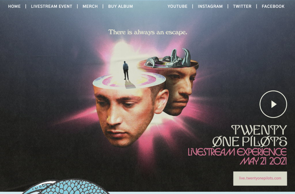
- They make good use to the above the fold area (the area you see before you have to scroll) with an offer for the livestream concert
- After you scroll you see more offers to pre-save or check out merch
- Near the bottom, you see they embed the videos for their latest singles.
You can see they put the most important goal they have, promoting the livestream event, at the top, and as you scroll down, they show more ancillary offers such as pre-saving or merch. You can see there is a hierarchy of importance to what they want people to do on their website.
- Selling the Livestream Event
- Pre-save / Pre-order Album
- Sell Merch
- Promote the latest single
What you need to do now:
- Decide your hierarchy of importance – is it collecting emails, selling..etc
- Research over 20 music artist website big and small and take some inspiration
- Take notes on what you see that that looks enticing — are there any offers that make you want to put in your email or buy something from them.
- Take notes on design elements
Step 4: Start Designing Your Website

You should now have a idea of what you want your website to achieve for you, and now it’s time to start making it come to life.
You should have gotten some inspiration from the research you did on other website. You need to distill that inspiration into something that is you.
Pick your theme or template
One of the biggest determiners of how your website will look is the theme or template that you select.
NOTE: A theme is what WordPress uses to manage the overall look of your website from the colors, to the default fonts used, header, navigation bar, and other important stylings. These themes can have templates built-in, especially if you are using a page builder such as Thrive, or Divi. Wix, Bandzoogle, and Squarespace work with templates.
You can use the template to also draw some inspiration from, but you are going to want be able to customize it to make it you. There are a few important things that you can change to make that happen.
Images
You are going to want to have some professional images, and logos, and other designs that represent your branding and imagery.
You can use your latest album art and create some textures and background images from the iconography.
Colors
I’m not a designer so I can’t get into color theory, but I know you should limit the amount of colors you use on your website if you are not experienced with design. I would have probably 2 and maybe even 3 colors on your website.
Your should have a primary “brand” color, secondary color, and maybe an accent color.
Again, the Twenty-One Pilots website is a good example of this.
TIP: Write down the hex number code of the colors you decide to use and SAVE IT somewhere you will remember. This is useful because you won’t have to search in your website html to check what exact color you used.
There are some great color palette generates out there. There are a few cool ones I checked out so you don’t have to google it. They are all free.
If you haven’t decided on any colors at all, then Canva also provides a lot of free education on color theory and the meaning and feelings that some colors inspire. If you want to dive deeper into branding and design, you can check out Canva’s free design school.
Take those resources and pick a color from your current images or album art, to help you build a color scheme for your website.
Decide on Your Fonts
This is another important factor that people often either overlook or go overboard with. You need to convey important information with the text on your website, so you want your main font to be large and simple enough to read.
Using an overly-stylized or small font is the fastest way to make people bounce away from your website. But…
That isn’t to say you can’t use those kinds of fonts in your homepage headline or to accent sections of your website. Just use them sparingly.
Also, you want to keep the font consistent throughout your website. The size of the main content font shouldn’t vary from page to page. If you use a different font for your headers, that should be consistent as well.
Another thing to consider is readability, you want to have enough contrast that the text is eligible. You should not have a dark background with dark text. Images also don’t make good backgrounds if there is text as it makes it difficult to read with all of the colors unless you modify it with a solid color overlay.
Site Map
You will want to now decide on what pages you want to have on your website because in the next section, we will be working on what pages you want to include in your website and navigation bar.
Remember, you will not need to have all of your pages in the navigation/header bar either. Many of the pages that are not important enough can have space in the footer of your website — your EPK (Electronic Press Kit) would be a good example of something you don’t want in the navigation bar.
Step 5: Build the Core Pages
We are going to now actually start building out the pages that we are going to need.
Homepage
The homepage of your website is the most important space, and the most people section is called the “above the fold”. This is the area that a person will see when they first land on your page.
This area is important because a vast majority of people will not even scroll down on your website. So you need to have something attention-grabbing.
So many people go wrong with just having a full-screen image of themselves along with their artist name. If the person is on your website, they really know who you are — unless they are very confused, and hopefully, they aren’t. This area needs to have a specific purpose. You will help people towards that goal by having an interesting headline and a CTA (Call to Action) for a specific action — join the email list, sell tickets, stream the latest single.
That goal or purpose will depend on how big or small you are as a music artist and where you are in your music career, but for the majority of musicians or producers, this should be your top priority — collecting email addresses.
We will go over how to collect emails in later sections of the article, but you should have an exciting and interesting offer promoted in the area above the fold.
I will go ahead and mention there is going to be a pretty big difference between most major label artists and more independent musicians. The Record label hires someone to build the website, and in most cases, most are not interested in collecting emails or creating effective websites — many simply act as a business card or a hub for their social media link
Let’s look at some (good & bad) examples
Bruno Mars
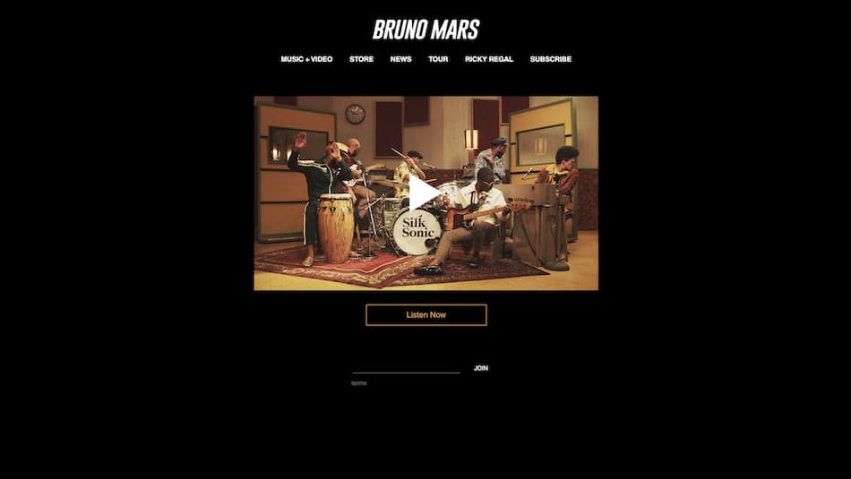
This is a very minimalist website. It seems to only have to goal of promoting the video and streaming of their latest song. Then there is the blank line with “JOIN”…I don’t think I would be motivated to put my email there
grandson.
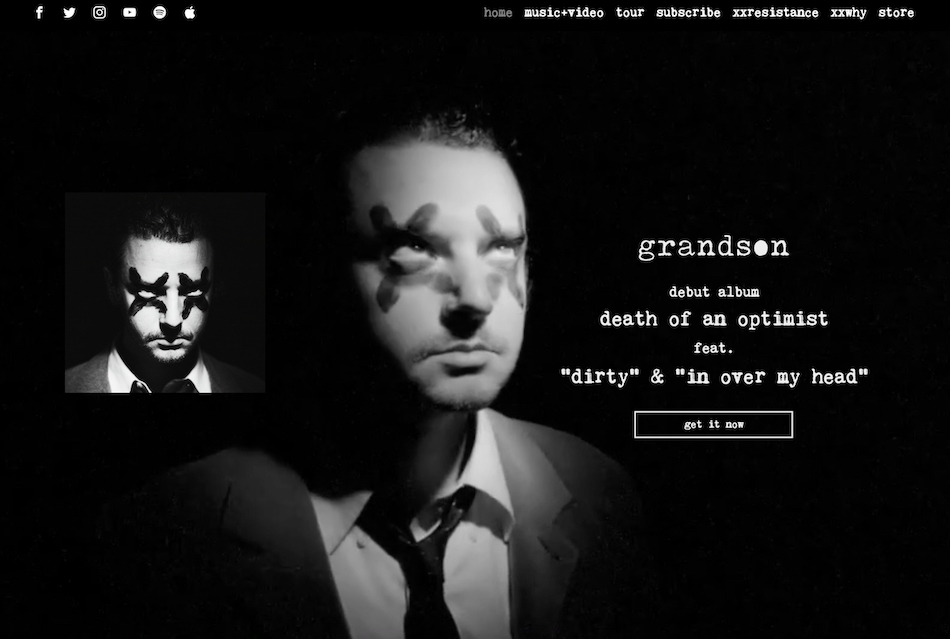
grandon.’s website had a nice video background from the latest music video and a clear call to action to get the latest album, which takes you to a link tree with options to buy tickets, merch, or stream.
Lil Nas X
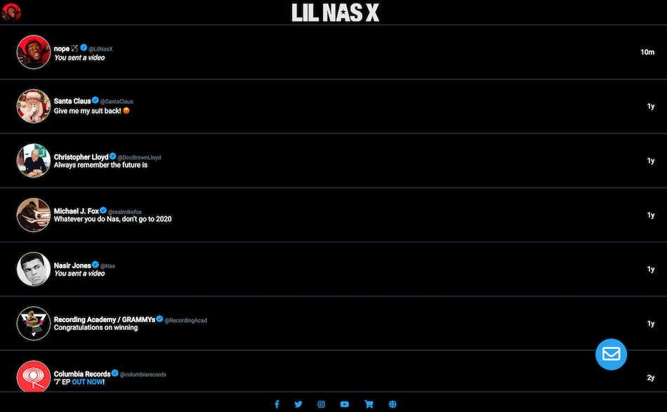
Lil Nas X’s website is interesting, and I could almost say unique, but it is built out to look exactly like a Twitter feed —cool. It’s very hard to navigate and isn’t very navigation-friendly. Also, the only link to the store is in the bottom blended in with the social media links?
Kytoon
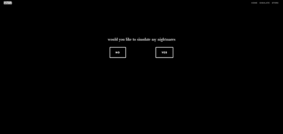
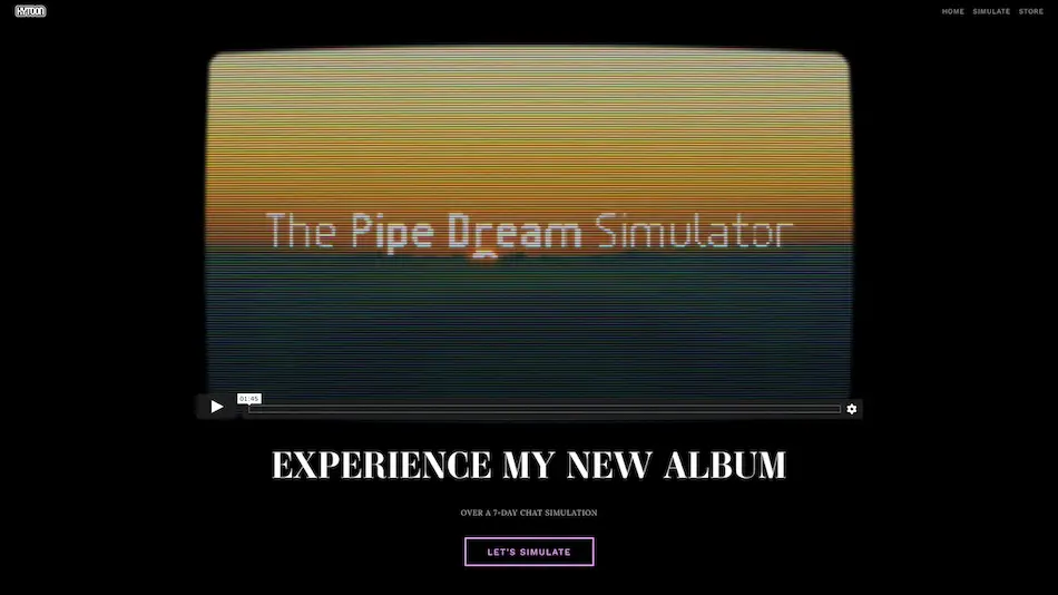
This website is unique in that the homepage is just a black page with a question and a choice. Clicking “yes” gets you started on his album experience journey and allows get the story and listen to the songs in a very interesting way.
I would definitely check out his great music and this very unique album promotion strategy.
Store
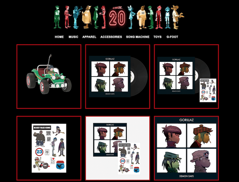
Building out the store of your website should also be one of your top priorities. The majority of revenue from artists with small to medium-sized fanbase come from selling merchandise — not royalties, unfortunately. You will want to build a store with as little friction for your fans as possible.
Most of the website platforms (Squarespace, Bandzoogle, Wix) offer e-commerce functionality built-in. With WordPress, it’s a little more complicated as you have to add in pages and use some 3rd party plugins — The most common is Woocommerce.
In the future, if you need more customization and features, many artists go with dedicated e-commerce solutions such as Shopify or BigCommerce.
Merchandising Tips
My tip for emerging artists would be to keep your store size small. In many cases, only having a single item in your store can actually lead to more sales. This item should be relatively low-priced and shouldn’t cost much to ship if it is a physical product. The idea behind this is that that original purchase opens the gateway for future purchases. People are much more likely to buy your stuff is they have already bought something before.
Artist Store Examples
Other Important sections
The sections that you have here are to help with some secondary or tertiary goals — sell merch, tickets, etc. That up to you to decide from the hierarchy that you brainstormed on when you were planning out the website in step 3.
These are some other important elements you should have on your homepage. These could either be a link to another page on your website or a standalone element:
- Link to Merch Page
- Upcoming shows
- Latest videos
- Music Player / Link to stream music
- Social media link (in the footer)
Step 6: Collecting Emails
As I have mentioned many times, collecting email addresses of your fans is one of the most important things you can do to boost your music marketing and promotion and drive sells.
But you are probably wondering how to actually start collecting these emails..
You will need to first sign up with a email marketing service such as Mailchimp, Mailerlite, ActiveCampaign, or a dozen others. Don’t worry you are not suck using the same service, you can easily download your list and switch to a another provider if don’t like them.
The most well-known is probably Mailchimp and they have a decent free tier, but their forms look horrible.
I use Mailerlite and they have a free option up to 1,000 subscribers.
Email marketing can get really advanced very quickly with features such asautomations and drip campaigns, but for the sake of just starting your website. It would be best to have a simple embedded form on your homepage that allows them to opt-in to your emailing list — you should incentivize this with some kind of offer.
Having people on a list is no use unless you actually do something with it. You should start sending out emails and newsletters on a consistent basis — the keyword here is consistant. You can dedide on the frequency. Once a month, bi-weekly.
These email marketing services also allow you to have a drip campaign that will automatically send out pre-written emails based on certain triggers that you choose. As I said, it can get pretty advanced pretty quickly.
Step 6: Setup Analytics and Pixel
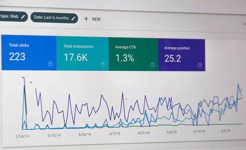
With social media, you immediately know how well your content is doing with the number of likes, follows, and comments you get. Each one of those is a data point to better understanding what is working, but in the scheme of things, that isn’t really in-depth or valuable data.
However, the data you can gain from your website through analytics and help you make marketing and promotional decisions.
Google Analytics
You need to have a google account and just head over to http://analytics.google.com/ to start getting setup.
Once you get setup you will have to add a little snippet of code to your website. Almost all of the website platforms have a place you can easily add this to your website, and it is easy enough on WordPress as well. Google have pretty good guides on want to do if you get stuck
Facebook Pixel
I know Facebook gets a very bad rep these days for their data collection policies, but having a simple Facebook pixel on your website don’t betray any trust of your visitors. If you have a bad taste about Facebook’s policies, don’t let that hold you back from making using retargeting campaigns. This website has a more detailed explanation of how a Facebook Pixel works and how to install it.
Step 7: Launch Your Website
You built out all of the pages, got your analytics sorted out, and your email marketing is in place.
You are finally ready to launch your website. This is the time to make sure you got all the pieces in place and all your t’s are crossed.
There are a few things that I would check to ensure the best user experience for people that visit your website and other technical details.
- Check the website on Mobile (Does everything look correct and buttons work)
- Getting an SSL certificate (for https://)
- Page load speed (People don’t like slow sites)
- Sign up for Google Search Console
- Check opt-in form works correctly
Final Thoughts
I hope that this guide has given you enough information to get started building a website for your music. Building a website is an extension of you, your music, and your business. I want you to feel inspired enough to take on the challenge of building a website. I’m not going to lie. Creating a website is difficult — technically and creatively.
Also I would love to check out your band or artist website!
After you get your website launched and you need help with making effective use of your website in your music marketing. I would check out the services that Indepreneur can offer. I have a full review of their music promotion training.
